After getting his BA in painting with an art history minor from SUNY New Paltz in 1993, Timothy Shamey, an Illustrator and designer living and working in New York City kicked off his professional career in 1995 with a piece he did for MAD Magazine. He was hooked and continued his independent illustrator until 1999 when he joined SME Branding as a Senior Designer. Additionally, he earned his MA in drawing with a computer graphics minor from New York University in 1996.
At SME, he created identities and built brands for both professional and collegiate sports teams and events. He continues to provide conceptual services, illustration in various media, identity design, art direction and creative consultation to an ever-growing list of clients.He considers himself privileged to be working with such companies as the NFL, NIKE, ESPN, Disney, Madison Square Garden and Kmart.
 What sparked my interest in drawing?
Some of my earliest memories are of making drawings. I’m not sure when I first put pencil to paper, but I vividly remember drawing every chance I got. If I think about it, a lot of times my drawings corresponded to watching cartoons. I loved Looney Tunes, especially, and so early on, I think I had a lot of humor in what I drew. My older brother liked to draw, as well, although he didn’t keep up with it… I was obsessive. When I wasn’t making my own drawings, I was often adding to his. I remember one period in particular where he was drawing helicopters (we lived near an army base and they were always overhead) and I was adding mustaches to those helicopters. One of us thought that was hilarious!
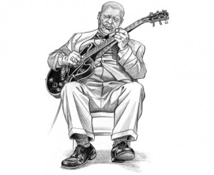
Anyway, since the drawings of my youth were often created from animation, I was interested in the motion of things – my early drawings were really quickly done and probably a real mess! Another thing that I recognize from back then was an interest in character. At the time, I suppose it would have been character in the literal sense (i.e. Bugs Bunny, Daffy Duck). Now, however, I’m talking about the character that an object, or the drawing of an object, has. It’s a sensibility that I’m very glad to have – I think it helps keep the drawings alive.
At age 4, I had life-changing event. I had finished a drawing and was particularly proud of it. I wanted to show my mom and so I quickly put on my boots to head outside. In my rush, I fell down a flight of concrete stairs and broke my left arm. She took me to the hospital – ironically with a break in my funny bone. It was a bad break and complications with it got me a 27 day hospital stay – all of it in traction. For my drawing, it was an important time. I couldn’t go anywhere, so I took more time with it. I really developed a lot of patience and discipline. Unfortunately for me, that event also marked the beginning of getting chronic migraine headaches which I still struggle with some 41 years later.
 Most pivotal moment of my career so far?
Moving to NYC completely changed the game for me as an artist. I came from a small town where, let’s just say, the arts weren’t exactly flourishing. I always dreamed of moving to California when I was a kid… Being an animator. Unfortunately or fortunately, I had earned my BA from a SUNY college and the mecca for animation at that time, CalArts, had an animation program based on the 4 year model. I would have to start over, and that wasn’t an option. So I came to NYU in 1994. I was 24, always broke and without an apartment. It was ROUGH! But being at NYU afforded me an unbelievable break and essentially kicked off my career as a professional illustrator.
Even though I was making “serious art” at NYU, my love of little cartoon drawings persisted – I became known in the small circle of Painting majors for doing them. One day, a classmate introduced me to a friend that wanted a caricature artist for a benefit for the homeless she was organizing. I used to do caricatures in festivals in the 1,000 Islands region before I moved to NYC, so I told her I would do it. When the day came, I had a massive migraine, but I had given my word, so I pushed through it. At the end of the evening, an old, white haired man approached me and said, “I’ve been watching you all night. I’ve seen what you’ve been doing. You drawings have a lot of humor in them.” With that he handed me his card – Joe Orlando, Vice President of MAD Magazine. “How would you like to come in with your portfolio?” I still sort of can’t believe it. His card and the letter he sent me asking me to do my first MAD job are framed and on my wall.
 Other artists that have influenced you and why?
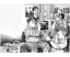
Getting a break to work for MAD Magazine was HUGE for me, because I had copied and learned from their artists since I was a kid. There are SO many great artists in those pages, although I always had an affinity for Mort Drucker’s work. To this day, I really don’t think you can beat Mort in his prime.
I spoke of Looney Tunes earlier. Chuck Jones work really influenced me. It’s so timeless, so brilliant. The Coyote and the Roadrunner can still make me laugh out loud.
Al Hirschfeld was incredible. There is a minimalism to his work that seems effortless. It was actually a LOT of hard work, but I love the work that LOOKS easy. It’s something I strive for but I don’t know if I have ever really achieved.
 My husband is from Michigan, therefore a lifetime Detroit Lion fan. You updated their latest logo, are there other brands/teams that you would like to collaborate with?
Your husband is from Michigan? I hope he LIKES the new Lions logo! In many ways, the LIONS are still my favorite team logo project, probably because they’re my first. Looking back, their old logo and typeface REALLY needed help, too, so really anything I did was going to be an improvement. Other teams have not been that easy. The Dolphins, for instance, were a LOT of work. Actually, both the Dolphins AND the Buccaneers were teams I worked on TWICE. The Bucs were started in 2007, dropped and then eventually finished in 2013. Crazy.
In contrast, work on the Carolina Panthers went very fast. I just hit it right. That one has a story to it that’s pretty amusing. The NFL approached the team about making a change (usually it’s the other way around). Their word mark was terrible and the owner, Jerry Richardson, said, “You can do anything you want with the type, just don’t touch my logo!”, which is what I was brought in to do. As I said, I just hit it right and the owner loved it. When the NFL presented my work, he said, “Don’t touch my NEW logo!”
I have also redone the logo for the Jacksonville Jaguars and the Minnesota Vikings, although the Vikings settled on pretty minimal changes. I was recently working on another team and I think their fans would have loved the change had the owner decided to make it. Unfortunately, the work got scrapped.
As far as teams I would like to work with… There are some teams that will likely NEVER change: The Cowboys, the Packers, the Saints and so on. I think the Raiders could be really badass with a refreshed mark. I also think the Rams could use a new mark – one that’s not so cartoony. I would love to get the opportunity to redo the Ravens – I really hate that logo. And the Jets really need help. I’d rather work on the Giants, but the Jets logo AND team need more help. You probably want me to say something about the Redskins, too. Ahem.
 You’ve also worked on many Super Bowl logos. What has been the most challenging aspect of working on the US’s biggest sporting event?
I am still extremely proud of the work I did on the Super Bowl. My first gig with the NFL was doing a Halftime Show logo for Super Bowl XXXIX and, just one year later, I was making nearly ALL the art for Super Bowl XL in Detroit.
What I can say about working on the Super Bowl is it’s INTENSE. I brought my own ideas of just HOW important the work was and was matched with a Creative Director that felt the same way. It’s a very good relationship the two of us have – neither of us want to settle and we are always pushing, pushing, pushing. It is grueling at times and I would be working at NFL headquarters until 1:30 in the morning.
There are a lot of things to consider when you’re working on the theme art (art that will be used to represent the game in print, on merchandise, in the stadium, on tv, etc) for this event . There are really three categories of art that I needed to create:
1. Football, duh! When everything is stripped away, the game of football has to be at the heart. This means illustrations of players, footballs and any other element of the game (goal post, field lines, etc).
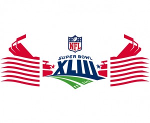
2. Host stadium. Iconic illustrations of the place the game is taking place. In the case of SB XLII, Arizona had a new, futuristic stadium shaped like a rattlesnake. It made for some really cool illustrations.
3. Host city. What can be said about the geographical location of the game and how can whatever that is relate back to football. It’s not enough to make beach things for Florida or cacti for Arizona. They have to tie back to the game. Everything starts with football and radiates out.
I had the opportunity to attend Super Bowl XLII in AZ and it was an experience I will never forget. From the moment I left the plane, I saw piles of merchandise in the airport shops, huge banners and environmental signs all with my art on it. It was surreal to say the least. Outside Cardinal’s Stadium, they had a giant merchandise tent and people were buying my stuff, wearing my stuff… They had carts FULL of stuff. I remember this guy holding up a beach towel and asking his wife, “What do you think of this?” It was WEIRD! I thought about my original sketches done in little 11”x14” books. It was really like being outside the whole thing. ALSO in that moment I became VERY aware of how much cha-ching was coming from this and that I had really received crumbs for my work.
 You worked on a project when Howard Stern move to SIRIUS Satellite radio. What is your approach to doing illustrations of famous people?
 Being a huge Howard Stern fan, I was thrilled to have the chance to do artwork for the show.
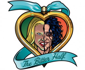
Incredible. Incidentally, I have a giant print of that first illustration I did for the show, essentially showing Howard and his crew in a pose inspired by Iwo Jima, signed by everyone. I did art for three of Stern’s on air roasts (Artie Lang, Baba Booey and Andy Dick) and sat front row in the studio for two of them – something you never forget. Working for Stern also gave me the opportunity to work with Sam Simon, a legendary Hollywood writer most famous for his work on the Simpsons.
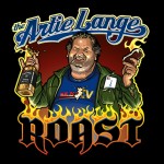

Anyway, as to your question of approaching illustrations of famous people, I want to capture something about that person. It’s really a lot easier to do famous people because there are so many images and all the public persona that exists. PLUS, you usually won’t hear about it if they don’t like it, unlike someone sitting right in front of you if you’re doing caricatures on the street. I’d say that my years of work as a MAD artist made me very comfortable drawing Stern.
 You’ve worked on projects for DC Comics and MAD, how has working on longer-form graphic novels influenced your static illustrations?
If I had to say more about MAD, I would say that it is a LOT more work than you could ever think. The MAD movie parodies were the pinnacle for me and I was incredibly fortunate to work on some for the magazine. They are a MONSTER, though, and there’s really nothing you can do to prepare yourself. Hahaha! When I worked for MAD, I worked 7 days a week and often for entire days on end. To finish my take on Adam Sandler’s Waterboy I stayed up 4 days in a row. That is completely without sleep. That’s hard on your body.
Back then working on a project for MAD was very different than it is now. This was the ‘90s and everything was done in person. I would go to the movies with the editors and the writer and then I would go home. In a few days, when a script was ready, I would go back into the MAD offices and meet with the editors. They would already have mapped out the number of pages and the number of panels per page as well as what dialogue went where. I would receive the script in two ways: First, typed out sequentially, then, put into a layout with word balloons. I would take this layout home and rough in my vision of how it would look. Then, I’d take it back to the MAD offices and meet with the editors. Once it got approved, I went home to work on the pencils, always at 200% actual size on poster board. Once the pencils were done, you guessed it, back to MAD. There was a lot of running around with my giant portfolio as well as lots of time at the newsstands and bookstores to get reference images. What I couldn’t find, I photographed myself and had developed at a one hour photo. As for the art, I got one shot. It was all pen & ink and watercolor, so there was no messing up. All this was done as quickly as possible to get it into the next issue. It was a TON of pressure. It’s pretty crazy when I look back on it.
 What’s your advice for someone that wants to take on editorial illustration?
I don’t think you can go wrong with a strong background in drawing. At least for me, that is at the base of everything. It’s good to take drawing classes, to see how others are approaching it and who else is out there. It’s important to draw in different ways and with different tools because it you learn important things from those experiences. Draw from the model, go out in the field with a sketchpad, draw off your computer monitor… You’ll never be sorry for mixing it up.
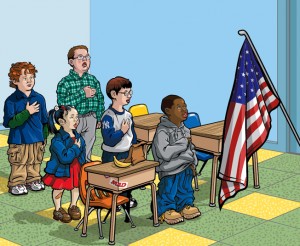
I would saw if you’re going for editorial work, it is good to have a recognizable, signature style. I am a bit of a chameleon and can do a lot of different things. I have had my portfolio (in the days when you actually carried those things around) mistaken for an artist rep’s book of samples. In other words, people have a hard time believing one person did all the work. While that can be flattering, applied to editorial work, it is not necessarily good. People want the product they are familiar with: David Cowles looks like David Cowles, Drew Friedman looks like Drew Friedman, and so on.
I would also say to spend time looking at magazines and newspapers. Don’t just go after publications in the Artist’s Market. See who uses what, how many but also look at the tone and if it’s appropriate to your work or if you can make your work appropriate to it. Have realistic goals: Not every illustrator can be in Rolling Stone but most of them want to be. Shoot for it, but also pick some publications with better odds.
 You have a concentration in sports & entertainment. Are there other areas that you would like to explore?
There are a ton of things I want to do beyond what I am doing now. Expanding outward is hard because I believe there’s only so much creative energy one person has. I had an amazing painting teacher in the ‘90s, Arnold Mesches, who would say, “If you want to be an artist, get a job on a sandwich truck. Don’t WORK as an artist.” It really is true. After a grueling day, the LAST thing I want to do is push myself to do more. I try to steal tiny moments here and there, but at some point, you really need to carve real chunks of time out.
Some of the things I think about are:

Digital painting. I’d like to get deeper into rendering realistic looking artwork.
3D modeling. There’s some incredible stuff out there and I’d love to explore it more.
A return to art for art’s sake. I feel like I have somewhat of a head on my shoulders now and something to say. It’s a hard grind, though, and my problem would be the BS in the art world… The reason I steered away from making paintings and such in the first place.
I still love animated cartoons, so I would love to do something with that. This could mean doing some more animation (I did some in college), but would more than likely be in creating characters and writing.
I’d like to do some art in public spaces – maybe a large scale mural (?)
I love NYC so I would love to do more New York-centric. I’d also like to get more involved with preserving NYC’s character and history, but that’s a whole other discussion.
 What does a typical day look like for you? Do you have “normal business hours”?
I think as varied as my portfolio is, so too is my “typical day”. For the on-site work I do with my clients, there’s a lot more structure. In at 9:30, out at6:30. Pretty standard. But the tricky part is controlling the workflow which I don’t think anyone can really do. There are usually a few brutal onslaughts of work per year when everyone is calling for things all due roughly the same time. I start to schedule projects for the nighttime, projects for the weekend – It’s a tricky balancing act. My life goes out the window except for the basics in these instances. Somehow, the periods when I am chained to my desk usually end up being the most beautiful days of the year.
 Where do you see your career in 5,10 years?
Where I would like to see myself in 5-10 years is benefiting more from the work I do.
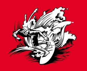
That will take creating art for my own use, not for someone else. I love to see my art out in the world when I turn on the TV or walk in a store, but right now that is driving someone else’s profits. I don’t need anymore proof that the work I do will sell, I just need the right vehicle to have it earn for me beyond a work-for-hire situation. In this scenario, I’d break the work/pay, work/pay, work/pay cycle, have a little more time away from my desk and enjoy life a little more with my wife.
Share:


 Your husband is from Michigan? I hope he LIKES the new Lions logo! In many ways, the LIONS are still my favorite team logo project, probably because they’re my first. Looking back, their old logo and typeface REALLY needed help, too, so really anything I did was going to be an improvement. Other teams have not been that easy. The Dolphins, for instance, were a LOT of work. Actually, both the Dolphins AND the Buccaneers were teams I worked on TWICE. The Bucs were started in 2007, dropped and then eventually finished in 2013. Crazy.
 Incredible. Incidentally, I have a giant print of that first illustration I did for the show, essentially showing Howard and his crew in a pose inspired by Iwo Jima, signed by everyone. I did art for three of Stern’s on air roasts (Artie Lang, Baba Booey and Andy Dick) and sat front row in the studio for two of them – something you never forget. Working for Stern also gave me the opportunity to work with Sam Simon, a legendary Hollywood writer most famous for his work on the Simpsons.
 Anyway, as to your question of approaching illustrations of famous people, I want to capture something about that person. It’s really a lot easier to do famous people because there are so many images and all the public persona that exists. PLUS, you usually won’t hear about it if they don’t like it, unlike someone sitting right in front of you if you’re doing caricatures on the street. I’d say that my years of work as a MAD artist made me very comfortable drawing Stern.
 Digital painting. I’d like to get deeper into rendering realistic looking artwork.
 That will take creating art for my own use, not for someone else. I love to see my art out in the world when I turn on the TV or walk in a store, but right now that is driving someone else’s profits. I don’t need anymore proof that the work I do will sell, I just need the right vehicle to have it earn for me beyond a work-for-hire situation. In this scenario, I’d break the work/pay, work/pay, work/pay cycle, have a little more time away from my desk and enjoy life a little more with my wife.